06. Combining Fluid Layouts
Combining Fluid Layouts
You've seen this layout before, but you haven't had a chance to modify its CSS yet. For this exercise, you'll be adding some CSS breakpoints to some HTML, so that the page layouts match what you see below:
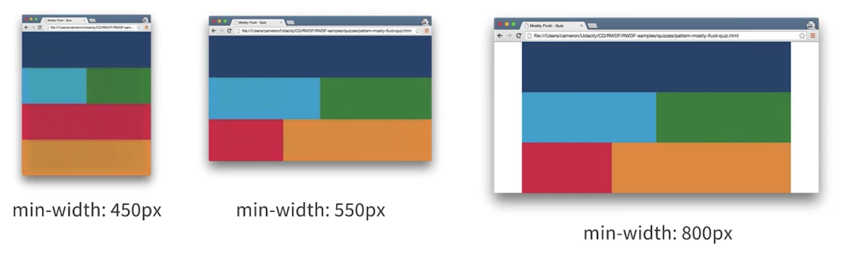
Note that at a minimum width of 550px, the red element takes up only about a third of the viewport, and the orange box takes up the other two thirds. And at 800px, the only difference is the appearance of left and right margins.
Instructions
In the <head> of the document, you'll find two <style> tags. The first has default styles, and you won't need to change these (comments have been provided in the starter code). The second, however, includes responsive styles and this is where you're going to put your breakpoints!
Feel free to work locally with the starter code. Likewise, you are welcome to work directly in your browser in the workspace below. Be sure to size and resize the rendered HTML page to see how things look with the code you write!
At the end, check out how your finished CSS compares with the solution provided in the workspace below. How do things look?
Workspace
This section contains either a workspace (it can be a Jupyter Notebook workspace or an online code editor work space, etc.) and it cannot be automatically downloaded to be generated here. Please access the classroom with your account and manually download the workspace to your local machine. Note that for some courses, Udacity upload the workspace files onto https://github.com/udacity, so you may be able to download them there.
Workspace Information:
- Default file path:
- Workspace type: html-live
- Opened files (when workspace is loaded): n/a